
The Greens in Regulation statistic has been a staple of golf analytics for decades. As I discussed in my last post, higher GIR correlates with lower scores across a wide variety of skill levels. I concluded my last post by suggesting that all players should include GIR tracking as part of a data-driven improvement plan.
However, my analysis uncovered a trend among players on the PGA Tour: Greens in Regulation matter less now than they ever have. Looking decade by decade, we see a clear weakening of the correlation between GIR and scoring average since the 1980s. According to the data, a tour player today who improves his GIR is not as likely to get the same scoring benefits as his predecessors 30 years ago.
This article discusses the changes in correlation through the years, and the extent to which the significance of GIR has truly changed. In trying to understand the reasons behind this change, I have discovered the situation is more complex and nuanced than I had expected. I want to be sure of the quality of my analysis, so the reasons behind this change will be explored in a future post.
The Problem: GIR and Scoring Over Time
The last article included a plot of career scoring average vs career GIR for all players from 1980 to 2018. A similar plot is shown below: this one is color coded to show player performance in different decades:
Overall this chart shows a reasonably strong linear trend – while there is some variation, players with higher GIR have a lower scoring average. However, we also see a noticeable difference in the pattern from decade to decade (this can be most easily seen by clicking on the decades in the legend to see them one at a time). The most significant difference is between the 1980s and the 2010s – the chart below shows just these two decades for a clearer comparison:
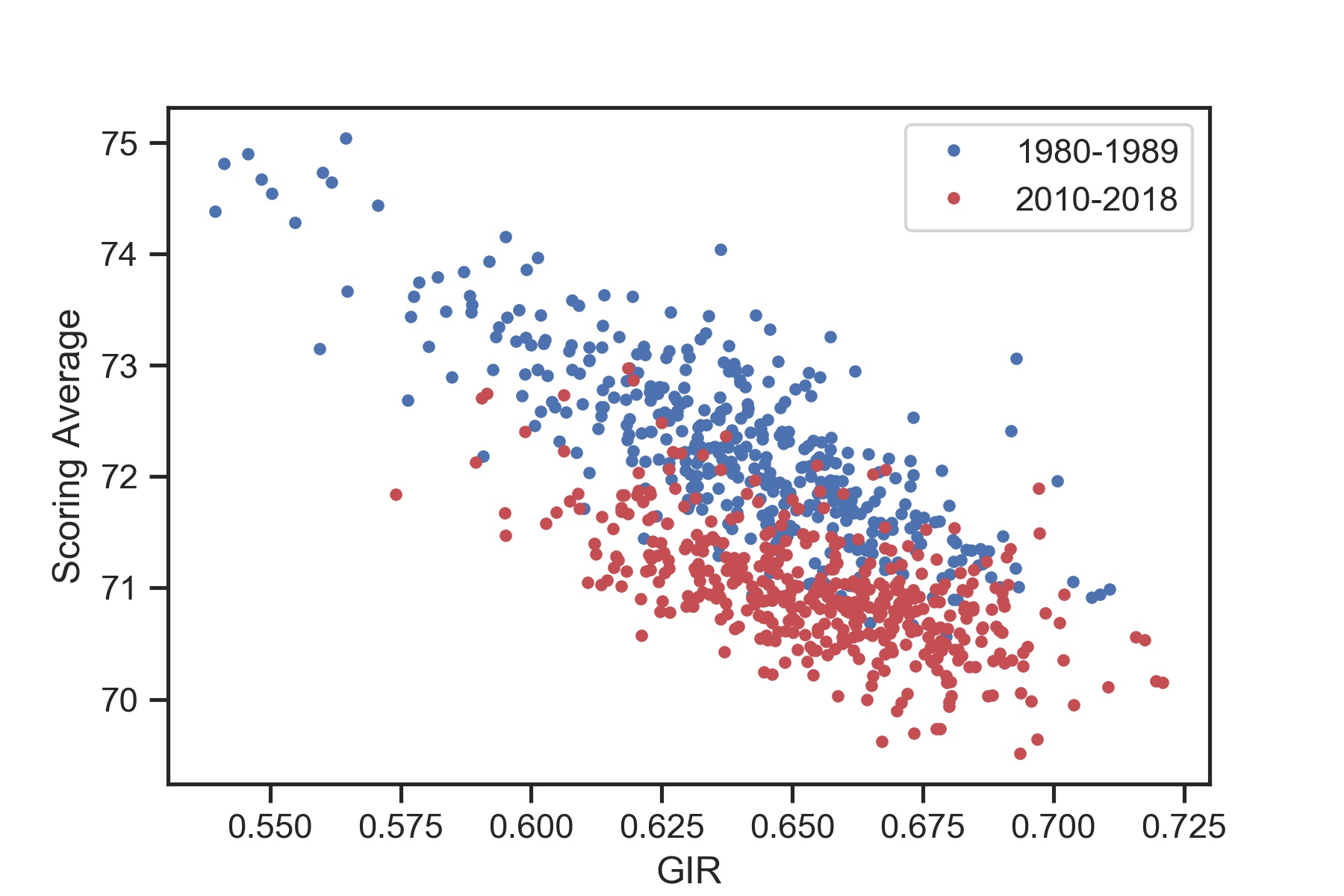
The first thing to note is that the players from the 2010s generally have lower scores than in the 1980s. In the 80s there were several players who averaged above 74 – in this decade not a single player had a scoring average over 73. Players today are also generally hitting more greens in regulation – most of the 2010 data is clustered on the right. However, the 2010 data doesn’t quite fit with the 1980 trend. The chart suggests that the 1980s data would not be an ideal predictor of modern scoring – for a specific GIR, the 1980s trends would usually predict a higher scoring average than what a modern player would actually have. These trends apply to the 1990s and 2000s as well – each decade shows a downward shift in scoring average with only a marginal increase in GIR.
The changes in the linear trend statistics are even more noteworthy. Recall from the last post that the value represents the fraction of the variation in the data that can be explained by the linear model, and is used to evaluate the overall fit quality (on a scale from 0 to 1). Also recall that a linear fit is characterized by its slope (the steepness of the line) and intercept value (the amount the line is shifted up or down). The table below shows the intercept, slope, and values for each decade:1
| Decade | Intercept | Slope | |
|---|---|---|---|
| 1980-1989 | 86 | -22 | 0.64 |
| 1990-1999 | 84 | -19 | 0.59 |
| 2000-2009 | 83 | -18 | 0.47 |
| 2010-2018 | 80 | -14 | 0.37 |
This table highlights how the trends in the data change by decade. First, the intercept value drops by 1-3 strokes each decade, suggesting that scores are dropping faster than can be explained by GIR alone. Second, the slope values are all negative (meaning an increase in GIR leads to a decrease in scores), but the values are becoming less negative (more shallow). This means that an increase in GIR corresponds to a smaller decrease in score now than it did in the past.
Finally, the value decreases in each successive decade, meaning the relationship between scoring average and GIR has become less pronounced over time. In the 80s, roughly 64% of the variation in scores on tour could be accounted for by differences in GIR. Today only 37% of the variation is explained in GIR variation. To see this more clearly, consider a plot of the data from the 1980s below:
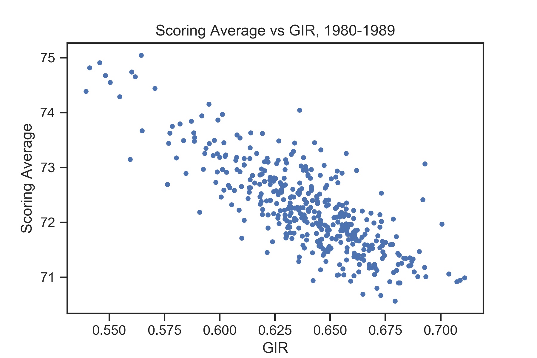
While there is certainly some variability in the results, it would be pretty easy to accurately estimate a best-fit line through this data. The players with some of the highest GIR stats tend to have some of the lowest scoring averages, and vice versa.
Compare this to the data from the 2010s:
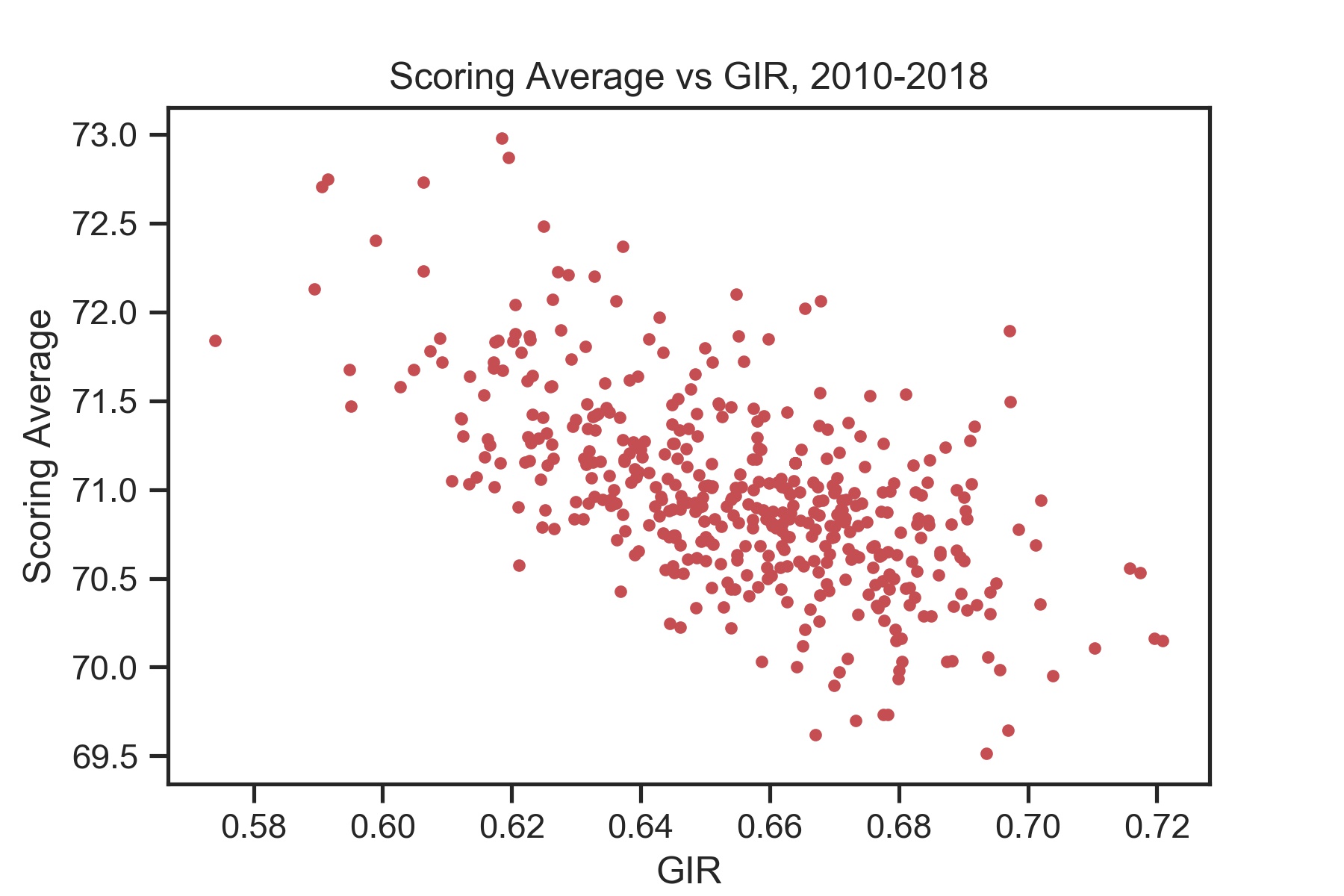
There is still a trend, but it would be much harder to estimate a best-fit line through this data. The best GIR performers tend not to have worst scores on tour, but we cannot say for sure that they will be among the lowest scorers – there is too much variation in the data.
We can summarize what we have seen so far with the following statements:
- Players are scoring lower in each decade than they did in the decade previously, and the decrease in scoring cannot be explained solely by improved GIR. This is evidenced by a decrease in the intercept value for each decade
- Players who hit more greens today see less of an improvement in scoring than they did in previous decades. The slope of the linear fit is becoming less steep with each decade
- Greens in Regulation has become less predictive of scoring average with each decade. The decrease in means GIR can account for less of the variation in scoring average than it could before.
Having identified how the relationship between GIR and scoring average is changing, we would ideally like to know why this relationship has changed so much. As I mentioned at the top, the reasons for the change are complex, but we can start by looking at one key distinction between the Tour today and the Tour of the 80s.
A Partial Explanation: A More Competitive Tour
PGA Tour players today are scoring lower with less variation than ever before. Compare the distribution of scores in each decade shown in the following plot:
Not only are the scores on Tour lower now than in previous decades, they are more narrowly distributed too. This can also be seen in mean and standard deviations below:
| Decade | Mean Scoring Average | Standard Deviation |
|---|---|---|
| 1980-1989 | 72.2 | 0.8 |
| 1990-1999 | 71.8 | 0.7 |
| 2000-2010 | 71.3 | 0.6 |
| 2010-2018 | 71.0 | 0.5 |
The decreasing mean values says that on average players today are scoring lower. The decreasing standard deviation means that there is less of a difference between good and bad players today than in previous decades.
What does all this evidence of more competition on Tour mean for the relationship between scoring and GIR? The lack of variability could explain why the relationship between GIR and scoring average is no longer as strong.
Here is a useful analogy: Suppose you are interested in the relationship between a child’s age and his or her height. To investigate this, you gather data from thousands of pre-school, elementary, and middle school children. While there is certainly some variety in height among any given classroom, it is easy to find an overall trend: the older a child is, the taller he or she is.
Suppose instead of collecting heights from a wide range of ages, you only had access to a small range, say ages 8 to 10. With a smaller age range, it may not be as clear that older kids are taller – other factors like genetics and gender may make the data appear more noisy. It was much easier to see a clear trend when the range of ages was so large (pre-schoolers are almost never taller than fifth-graders), but when the range is small, other factors besides age may be more significant (an 8-year-old is not necessarily shorter than a 9-year-old).
Similarly, the broader range of scores in the 80s may make the relationship between GIR and scoring average more apparent than the smaller range of scores does today.
To resolve this this issue, we should make a comparison that does not take the spread of a given decade into account. We can do this by comparing the root mean square error (RMSE) for each decade. The RMSE is essentially how many strokes away from the best fit the data points are on average. Lower RMSE means the points are closer to the fit line, and therefore the fit is more robust. Essentially, RMSE can be thought of as the variation in strokes taken that isn’t accounted for by the model. While related to the value, the advantage of RMSE is that it has units (in this case the units are strokes), allowing us to compare one fit to another. Below are the RMSE values for each decade:
| Decade | RMSE (strokes) |
|---|---|
| 1980-1989 | 0.49 |
| 1990-1999 | 0.44 |
| 2000-2009 | 0.44 |
| 2010-2019 | 0.42 |
Interestingly, the RMSE is getting smaller by decade, not larger. This means GIR actually explains more of the strokes taken on Tour today than it did in the past.
How to we reconcile the decreasing RMSE (suggesting a better fit) with the decreasing value (suggesting a worse fit)? It all comes back to the increase in competitiveness on Tour. Players’ scores today are clustered together more closely, so much so that even though only 63% of the variance is not explained by GIR, the unexplained variance is still smaller today than in previous decades.
So it appears that the reason the correlation between scoring average and GIR is less pronounced today than in previous years is mostly due to how competitive the tour is today. There is less of a difference in scoring for different GIR abilities because there is less of a difference in scoring in general.
Next Steps
While the increase in competitiveness on Tour explains why the value has decreased, it does not explain the changes in the fit parameters themselves. The decreasing intercept value suggests that the today’s low scores are not primarily due to an increase in GIR – players are making gains elsewhere. The decrease in the steepness of the slope suggests that an extra green hit does not correspond to as large of a scoring benefit as it once did. These two effects cannot be explained by increased competitiveness – we must explore other ways the game has changed.
There are a number of ways the PGA Tour (and golf in general) has changed in the last 30 years. Driving distance has massively increased, technology has made all clubs more forgiving, turf management has led to a major increase in green speeds, and architecture and course setup philosophies have evolved. Any of these factors, a combination of them, or something else entirely could be responsible for the change in GIR trends. Some of these factors are easy to measure, while others may not be quantifiable at all.
Understanding these changes could have significant implications for how a Tour player should design his practice regimen and game plan. Therefore I will be taking some time to do the analysis and make sure the results are reliable and correct. When I have a clear answer, you will be sure to see it here.
-
The 95% confidence intervals did not change significantly by decade and are fairly centered about the fit value. The intercept confidence intervals are all approximately 2 strokes, and the slope confidence intervals are approximately 3 strokes per GIR. The intercept confidence intervals overlap for only the 1990s and 2000s. The slope confidence intervals overlap for the 1980s and 1990s and the 1990s and 2000s. ↩